In Design Milk’s Friday Five column last week, I got to gush about five things I’m obsessed with. My kind of interview — love getting people excited about the things that I love! Tap the link above for a little peek into some of the things that give me the most joy in life, and my reflections about them. You can probably make some guesses based on these photos, but you’ll have to read the article for the backstories!


Mixed: A New Diptych About The Mixed-Race Experience
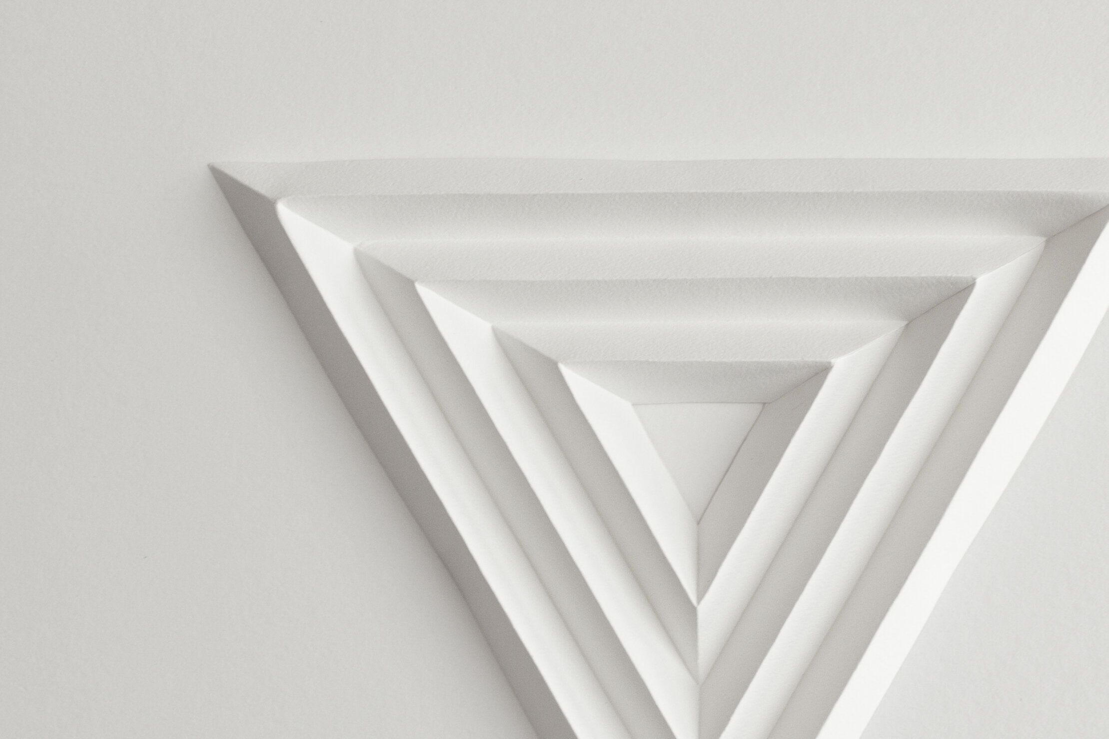
I’m excited to share with you a new project of mine that has a lot of personal significance to me. In this paper sculpture diptych, I explore my mixed-race heritage by examining ancestral hometowns on both sides of my family: the Northern Minnesotan town of Two Harbors on the left, and the Gujarati fishing town of Diu on the right.
This work illustrates a number of dichotomies that shaped my experience of being mixed: the nuclear family versus large, interconnected communities, individualism versus collectivism, and isolation versus enmeshment.


Here are satellite images of Two Harbors, MN (left) and Diu, Gujarat (right) for reference:


And here’s a fun little process video showing the hundreds of tiny paper boxes before they got glued down:
Next Crypto Art Release: Thursday, August 26
Mark your calendars: I’ll be releasing my newest NFT collection on Hic et Nunc on Thursday, Aug 26 at 12pm PDT.
This release is part of a project called SCAPES, curated by architect and designer Gerri Witthuhn. It’s a group of architects and artists exploring the intersection of architecture and the environment. Check out this dreamy, spacious collection on Instagram at @scapes.xyz, and on the web at scapes.xyz.
We chose to release our work on Hic et Nunc because it’s the most sustainable option for the climate right now. I’ve decided that I personally won’t use Ethereum until it’s fully proof-of-stake.
Like last time, I’ll be donating 10% of my revenue to the Anti Police-Terror Project, which protects communities of color in Northern California from police violence.

Design Milk Feature: How I Made Torus
This piece was just featured on Design Milk’s website and Instagram! I walked them through each step in the process of making Torus, this donut-shaped paper sculpture. Watch the preview video below, then read Design Milk’s article for more detail.


Clean NFTs: Video Interview with Vertical Crypto
In this video interview with Vertical Crypto, I talk about my experience getting into the crypto art space and releasing clean NFTs on Hic Et Nunc. Also interviewed are three of my fellow artists in The FEN: curator Juliette Bibasse and fine artists Kelly Richardson and Cadie Desbiens.
Book Feature — Paperists: Infinite Possibilities in Paper Art
My work is featured in a beautiful new coffee table book called Paperists: Infinite Possibilities in Paper Art by Sandu Publishing. You can get a sneak peek in this Colossal book review.
Other featured artists include JUDiTH+ROLFE, Pippa Dyrlaga, Makerie Studio, Ale Rambar, Zim & Zou, Diana Beltran Herrera, Sam Pierpoint, and Hazel Glass. All of them are worth following!
You can pre-order the book here.
Big Four Installation, Part II: Karl the Fog
In December, I did three large installations for the San Francisco office of a Big Four accounting firm. Each of their three executive boardrooms got a totally different style of installation. All three explored themes relating to the Bay Area.
This installation is a love note to Karl the Fog, San Francisco’s most iconic type of weather. By giving the fog its own nickname (and Twitter account), we’ve ascribed him intentions, feelings, and behaviors, which make his comings and goings all the more charming. As a Bay Area native, Divecha has always adored Karl the Fog. His presence feels comforting and familiar, like a cozy blanket on a cool morning.
Also see: Big Four Installation, Part I: Halfway to the Stars


Material Feels Podcast Interview
I’m excited to share an interview on Material Feels, a podcast that explores the intimate relationship between artists and their materials. Producer Catherine Monahon and I talk about my creative practice, how I discovered that paper was the right material for me, and the world I'm trying to create with my work.


Our conversation was delightful, snappy, silly, and energetic. I was thrilled to be talking to someone who not only deeply understands what’s like to work with one’s hands, but someone who is also similarly sensitive to noise! We even went on a whole long tangent about how to unload a dishwasher while minimizing clanging dish noises. (For your sake, though, Catherine edited out much of that bit.)
You can listen to the episode above, on the Material Feels website, or wherever you normally get your podcasts (Spotify, Apple Podcasts, Stitcher). Enjoy!
Virtual Workshop: Papercraft Fundamentals
I’ll be teaching a virtual workshop on papercraft fundamentals through The Level Up Project on Sunday, April 25th! Make a set of polyhedrons out of paper while honing basic skills like cutting, scoring, folding, and gluing.

It’s open to anyone who can safely handle a craft knife, and thanks to The Level Up Project’s redistributive wealth model, it will be free or subsidized for some folks. I’ll ship you the tools and materials in advance, and then we’ll learn together live online on April 25th!
⫸ Sunday, April 25th
⫸ 2-3:30pm PT, 5-6:30pm ET
⫸ Cost: Tiered pricing based on wealth, access, and equity
⫸ Register now!


This Papercraft Fundamentals workshop is part of a series of classes from The Level Up Project. Their mission is to remove systemic barriers within the fields of craft and design, and to help folks develop physical skills in these industries.
The redistributive wealth model is rad, and it’s one of the main reasons I was excited to teach this workshop! I was able to create a career in the arts because of an immense amount of privilege, and I want to make it easier for other folks to access this field and build their own skills.
époque évolution Interview
I recently did an interview and shoot with époque évolution, a local clothing brand. In addition to the usual topics (who am I, what’s the deal with my art), you can also read about my favorite life hack for getting annoying tasks done, tips for aspiring artists, a book that fundamentally changed my understanding of racism in the U.S., hot takes on buttered toast and ume plum vinegar, a brief rant about Trump, and a much longer list of TV recs than literally anyone asked for. Read the profile here; some of my favorite shots here.


Letterform Archive Acquisition

My “Quiet Type” installation was just acquired by Letterform Archive, a museum dedicated to lettering, typography, calligraphy, and graphic design. It’ll be part of their permanent collection, and once things open up again, it’ll be on display for visitors to enjoy!
I can’t imagine a more meaningful home for this installation. Letterform Archive’s collection spans thousands of years of typographic history, and I’m humbled that they feel my art belongs there.
Also, I love that it’s going to be accessible to the public! Most of my artwork is currently in private collections, but this is one installation that anyone will be able to experience in person.
Some backstory: Two years ago, I participated in the 36 Days of Type, a global design competition in which illustrators, designers, and artists create one letter of the alphabet — and then the digits 0-9 — each day for 36 consecutive days. I had never undertaken that kind of rigorous creative challenge before, and scrambling to create a unique paper sculpture every day taught me so much about myself and my art practice. I was selected as one of six winners by Adobe, the competition sponsor that that year.
This series is one of my favorite things I’ve ever made, and I’m so glad I resisted the urge to split it up and sell it in parts. I wasn’t sure I would ever find the right home for the complete set, but two years later, I’m thrilled to have packed it up and handed it off to the team at Letterform Archive. Truly cannot imagine imagine better stewards for this beloved project.


Big Four Installation, Part I: Halfway to the Stars
In December, I did three large installations for the San Francisco office of a Big Four accounting firm. Each of their three executive boardrooms got a totally different style of installation. All three explored themes relating to the Bay Area.
This salon-style gallery wall, titled “Halfway to the Stars,” explores some of the many facets of California’s rich cultural history. Hidden amongst the abstract shapes and patterns are recognizable landmarks like the Golden Gate Bridge, Coit Tower, the Transamerica Pyramid, and the California poppy. Less obvious motifs and symbols include: Ohlone shellmounds, to honor the unceded Indigenous territory we currently occupy. The pink triangle, for San Francisco’s history of LGBTQ and AIDS activism. Railroad tracks, to recognize the labor of Chinese immigrants who built much of the state’s early infrastructure. And rows of crops, to acknowledge the Latinx farmworkers who grow our food.